Staring at paint swatches and wondering if your sofa will clash with your new curtains? You’re not alone. Choosing a living room color scheme can feel overwhelming when you’re standing in your space imagining a dozen different possibilities. The good news is that certain color combinations have stood the test of time for a reason—they simply work, regardless of your home’s style or your personal taste.
Start With a Neutral Foundation
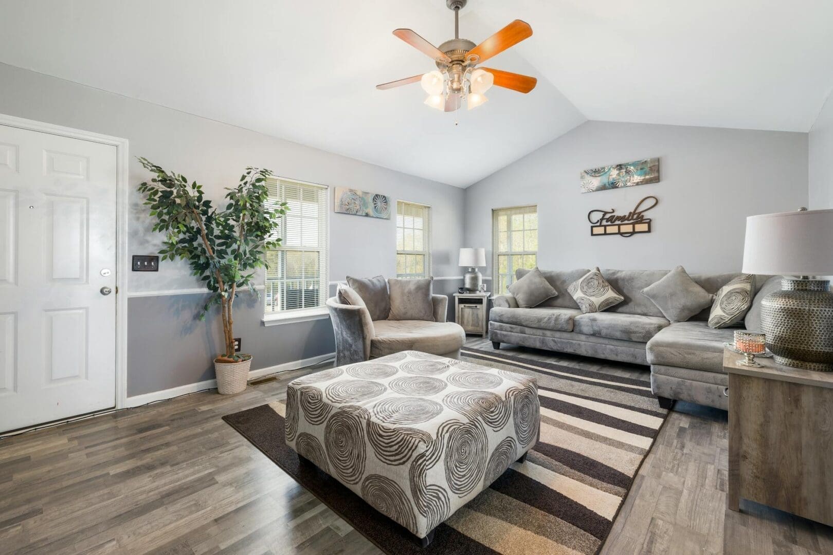
The most versatile living room color schemes begin with a neutral base. Think of neutrals as your canvas—walls in soft white, warm beige, greige (that perfect gray-beige hybrid), or even a gentle dove gray give you flexibility to change accent pieces without repainting.
When shopping for major furniture pieces like sofas and sectionals, neutrals make practical sense too. A quality sofa is an investment, typically ranging from $800 for budget-friendly options to $3,000+ for premium pieces, so choosing a neutral upholstery color ensures it’ll work with your evolving style. Look for sofas in linen, oatmeal, charcoal, or taupe—these shades pair beautifully with virtually any accent color you’ll add later.
Your area rug is another foundational piece where neutrals shine. A natural jute rug, cream wool option, or subtle gray pattern creates grounding without competing with your other design elements. Budget around $200-$500 for a quality 8×10 rug that’ll anchor your seating area.
The Foolproof Three-Color Formula
Interior designers rely on a simple rule: choose three main colors in a 60-30-10 ratio. Your dominant color (60%) covers walls and large furniture, your secondary color (30%) appears in upholstered chairs, curtains, or a statement rug, and your accent color (10%) pops up in pillows, throws, artwork, and decorative objects.
Here are combinations that consistently deliver beautiful results:
Warm and Welcoming: Cream walls (60%), camel or terracotta furniture (30%), and navy or forest green accents (10%)
Cool and Sophisticated: Soft gray walls (60%), blue-gray upholstery (30%), and brass or gold accents (10%)
Fresh and Timeless: White walls (60%), natural wood and beige tones (30%), and black accents (10%)
Rich and Cozy: Greige walls (60%), olive or sage green furniture (30%), and rust or burnt orange accents (10%)
When shopping for accent chairs—which typically run $300-$1,200 depending on quality—you have more freedom to embrace that secondary color. A dusty blue velvet chair or a sage green armchair can define your entire scheme while remaining sophisticated enough to enjoy for years.
Adding Pattern and Texture Within Your Palette
Once you’ve established your color scheme, patterns and textures keep things interesting without creating visual chaos. The key is staying within your chosen palette while varying the scale and type of patterns.
Mix a large-scale pattern (like a bold geometric or floral rug) with medium patterns (perhaps striped or ikat throw pillows) and small patterns (a subtle textured throw blanket). Coffee table books, ceramic vases, and decorative trays in your accent colors tie everything together. These smaller items, usually $25-$150 each, let you experiment with trends without major commitment.
Texture adds depth even when colors are similar. A chunky knit throw, smooth leather ottoman, nubby linen curtains, and glossy ceramic lamps all in complementary neutrals create visual interest through varied surfaces. When shopping for window treatments, look for fabrics that either match your secondary color or stay neutral—budget $100-$400 for quality ready-made curtains, or $400-$1,200 for custom panels that perfectly fit your space.
Balancing Warm and Cool Tones
Even within a single color family, temperature matters. A room done entirely in cool grays can feel sterile, while all-warm beiges might seem dated. The most successful living rooms balance both.
If your walls lean cool (gray, blue-gray, crisp white), warm up the space with wood furniture, camel leather, or rust-colored textiles. Conversely, if you’ve chosen warm walls (cream, beige, greige), introduce cooler elements through metal finishes like brushed nickel or chrome, glass tables, or steel blue accents. This balance keeps your space feeling collected and intentional rather than showroom-perfect.
Your living room should feel like home, not a magazine spread you’re afraid to use. These tried-and-true color schemes give you a framework to build from, whether you’re starting completely fresh or working with existing pieces you love. Choose your neutral foundation, select your three main colors, and layer in texture and pattern—you’ll end up with a space that looks professionally designed and actually feels like you.
There’s nothing quite like settling in for movie night at home, but harsh overhead lighting can ruin the whole experience. Too bright, and you’re squinting at a washed-out screen. Too dark, and you’re fumbling for the remote or straining your eyes. Getting your living room lighting right for movie watching isn’t complicated—it just takes the […]
You probably reach for your phone to change the temperature, lock your doors, or check who’s at the front door—so why are you still walking across the room to flip light switches? Smart lighting transforms your living room from a space with basic on-off switches into one that adapts to movie nights, dinner parties, reading […]
A chandelier can transform your living room from ordinary to unforgettable, but choosing the wrong size or style can throw off your entire space. Unlike task lighting that quietly does its job, a chandelier makes a statement—which means getting it right matters. Whether you’re working with vaulted ceilings or a cozy 10×12 room, here’s how […]