You’ve installed floating shelves in your living room, and now they’re just sitting there empty—or worse, cluttered with random stuff that doesn’t look intentional. The promise was sleek, modern storage that adds personality to your space, but getting from bare shelves to that perfectly curated look you see in magazines feels surprisingly tricky. The good news? Styling floating shelves isn’t about having the perfect objects or an unlimited budget. It’s about understanding a few key principles that make any arrangement look thoughtfully designed.
Start With the Right Foundation: Choosing Your Shelf Configuration
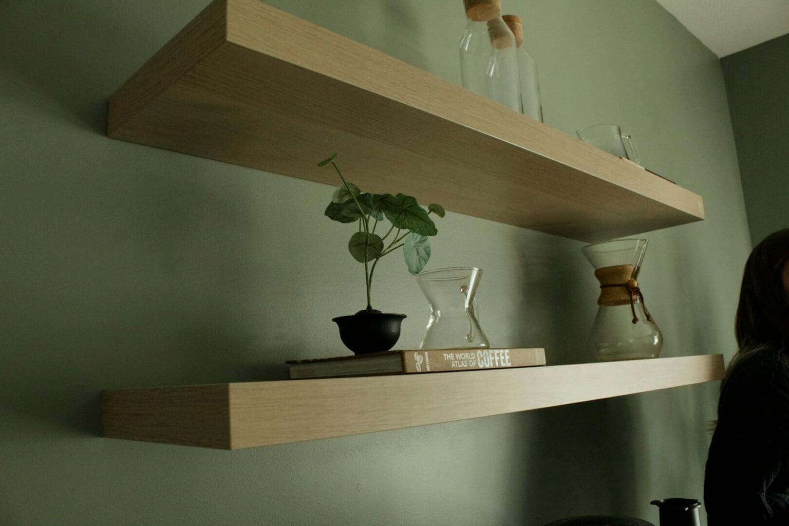
Before you pile on the decor, think about your shelf setup itself. A single long shelf creates a horizontal gallery perfect for a symmetrical arrangement, while staggered shelves at different heights give you more flexibility for an organic, collected-over-time look. Two shelves stacked directly above each other work beautifully when you want to create visual columns or pair larger items on the bottom with lighter pieces up top.
Consider the wall color and what’s nearby. Dark shelves pop against light walls and can ground a space, while natural wood or white shelves blend more seamlessly. If your living room already has a lot going on—patterned furniture, bold artwork—simpler shelf styling will keep things from feeling chaotic. In a more minimal space, your shelves can be the star.
The Rule of Three: Balancing Books, Objects, and Negative Space
Professional stylists swear by odd-numbered groupings, and it really does work. Think of your shelf in thirds: books, decorative objects, and intentional empty space. The mistake most people make is filling every inch. That careful balance between styled and sparse is what makes floating shelves look expensive rather than cluttered.
For books, try stacking some horizontally and standing others vertically. A short stack of three to five coffee table books (art, photography, design) with their spines facing out creates visual weight and gives you a platform for placing smaller objects on top. Mix in one or two bookends—sculptural ones in brass, marble, or wood add substance and keep vertical books from toppling.
Your decorative objects should vary in height, texture, and shape. A tall ceramic vase, a small framed print leaning against the wall, a wooden bowl, a sculptural candlestick—this variety keeps the eye moving. Budget-friendly finds from vintage shops or even nature (interesting branches, stones, driftwood) work just as well as pricey gallery pieces. The key is that each item should feel intentional, not like something that just landed there.
Layering and Depth: Creating a Designer Look
Flat arrangements look amateur. To add depth, layer items in front of each other. Lean a piece of framed art against the wall, then place a small plant or object in front of it. This overlapping creates dimension and makes your shelves feel more dynamic.
Plants are your secret weapon here. A trailing pothos in a simple ceramic pot softens hard edges and adds life without overwhelming the space. Small succulents, snake plants, or even high-quality faux stems (if your living room lacks natural light) bring in organic shapes that contrast nicely with geometric objects and straight book spines.
Play with height by using different sized objects and creating visual triangles. If you have a tall vase on the left, balance it with a medium-height stack of books in the center and a low, wide bowl on the right. Your eye should travel across the shelf in a pleasing rhythm, not get stuck in one spot.
Color Coordination Without Being Matchy
You don’t need everything to match, but a loose color story ties the look together. Pull two or three colors from your living room—maybe the blue in your throw pillows, the warm wood tones of your coffee table, and crisp white. Look for books, vases, and objects in those shades. This doesn’t mean everything needs to be perfectly coordinated, just that there’s a thread connecting the pieces.
Metallic accents in brass, copper, or matte black add a polished touch without introducing new colors. A brass picture frame, a black and white photograph, a copper planter—these work as neutrals that elevate your arrangement.
Styling floating shelves is really about editing. Start with more than you think you need, then remove pieces until it feels balanced. Walk away, come back, and see what catches your eye. The goal is a living room that feels personally yours—curated but never fussy, interesting but still livable.
There’s nothing quite like settling in for movie night at home, but harsh overhead lighting can ruin the whole experience. Too bright, and you’re squinting at a washed-out screen. Too dark, and you’re fumbling for the remote or straining your eyes. Getting your living room lighting right for movie watching isn’t complicated—it just takes the […]
You probably reach for your phone to change the temperature, lock your doors, or check who’s at the front door—so why are you still walking across the room to flip light switches? Smart lighting transforms your living room from a space with basic on-off switches into one that adapts to movie nights, dinner parties, reading […]
A chandelier can transform your living room from ordinary to unforgettable, but choosing the wrong size or style can throw off your entire space. Unlike task lighting that quietly does its job, a chandelier makes a statement—which means getting it right matters. Whether you’re working with vaulted ceilings or a cozy 10×12 room, here’s how […]