Staring at paint swatches while your dining room walls silently judge you? You’re not alone. Choosing the right paint color for a dining room feels especially high-stakes because this is where you’ll gather with family and friends, and where the lighting shifts dramatically from morning coffee to evening dinner parties. The good news: a few straightforward considerations will help you land on a color you’ll love for years.
Consider Your Dining Room’s Natural Light
Before you fall in love with a paint chip, spend a day observing how light moves through your dining room. North-facing rooms tend to cast cooler, bluer light that can make colors feel subdued, while south-facing spaces bathe everything in warm, golden light that intensifies paint colors.
If your dining room gets limited natural light, darker colors can actually work beautifully—they create an intimate, cocooning effect that’s perfect for evening entertaining. Think deep navy, charcoal, or forest green. These moody hues make candlelight glow and give the space a sophisticated, restaurant-like ambiance.
Brighter dining rooms give you more flexibility. Soft neutrals like greige, warm white, or pale sage will feel airy and fresh. Just remember that intense sunlight can wash out very pale colors, so don’t be afraid to go a shade or two darker than you initially planned.
Match Your Color to Your Dining Style
Your dining furniture and decor should guide your paint choice, not fight against it. Take stock of what you already have—or what you’re planning to buy.
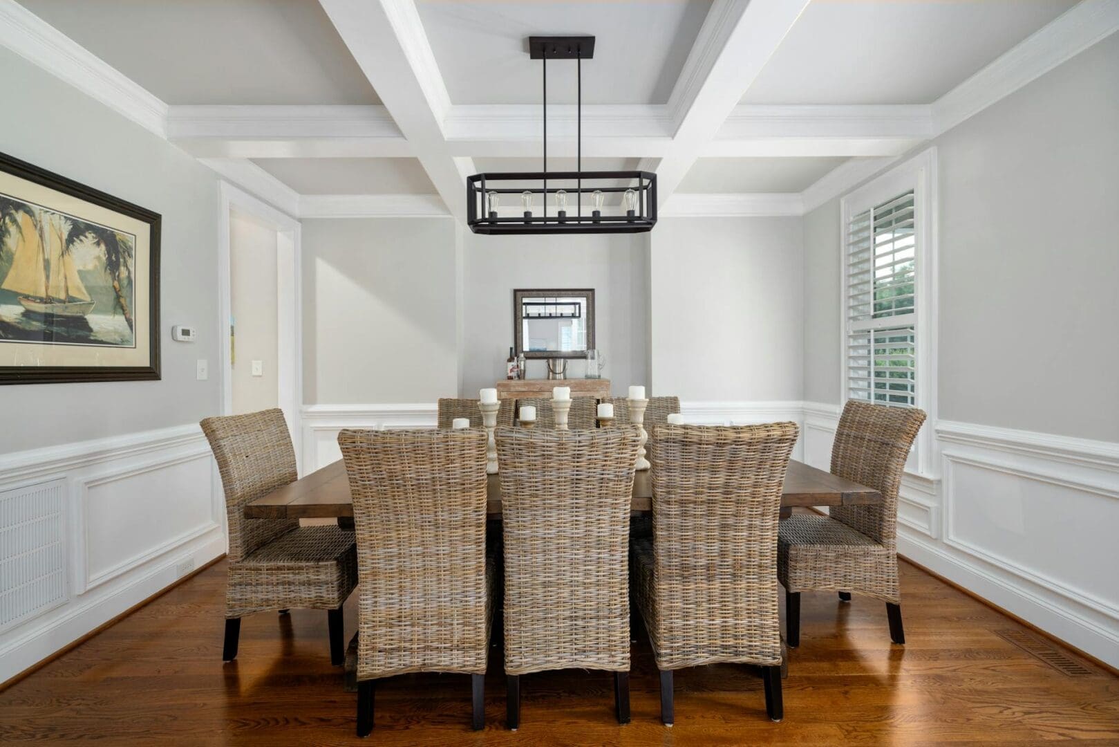
For traditional dining rooms with wood tables and upholstered chairs, classic options like Benjamin Moore’s Revere Pewter or soft blues and greens create an elegant backdrop without competing for attention. These colors have stood the test of time because they work with both warm wood tones and cooler metallics.
Modern or minimalist spaces benefit from crisp whites, soft grays, or even bold statement colors like terracotta or deep plum. The cleaner lines of contemporary furniture can handle more dramatic paint choices.
If you’re mixing styles—say, a modern glass table with vintage chairs—stick with neutral wall colors that let your eclectic pieces shine. A warm off-white or soft greige gives you a versatile canvas.
Understand Undertones (They Matter More Than You Think)
Here’s where most people go wrong: they pick a “gray” that looks perfect in the store, then get it home and suddenly their walls look purple. The culprit? Undertones.
Every paint color has an undertone—a hint of another color lurking beneath the surface. Grays might lean blue, purple, or green. Beiges can skew pink, yellow, or gray. These undertones become glaringly obvious once the paint is on your walls, especially in different lighting conditions.
The fix is simple: get sample pots and paint large swatches directly on your dining room walls. Look at them in morning light, afternoon sun, and evening lamplight. See how they interact with your table, chairs, and flooring. This $15 investment in samples will save you from a $300 repainting job.
Pay special attention to how your paint choice looks next to your home’s adjacent rooms. If your living room is a warm cream, a dining room in cool gray might create an awkward transition.
Think About the Mood You Want to Create
Paint color directly affects how a room feels, and dining rooms have a unique job: they need to feel welcoming for casual Tuesday night dinners but also special enough for holiday gatherings.
Warm colors—soft corals, terracotta, buttery yellows, and rich creams—stimulate appetite and conversation. They make people feel instantly comfortable and tend to look flattering in candlelight, which is a nice bonus if you entertain.
Cool colors like soft blues, sages, and lavenders create a calming, elegant atmosphere. They’re particularly nice in formal dining rooms or homes in warmer climates where you want the space to feel refreshing.
Don’t overlook the power of white, either. A crisp, warm white with creamy undertones feels clean and classic, making your table settings and artwork pop. It’s particularly smart if you like to change your decor seasonally.
Choosing a dining room paint color doesn’t have to be overwhelming. Focus on your lighting situation first, consider what you’re pairing the color with, test those undertones thoroughly, and think about the atmosphere you want to create. The right color will make your dining room feel like exactly where everyone wants to gather—and it’ll look just as good with Thursday’s pizza as it does with Thanksgiving dinner.
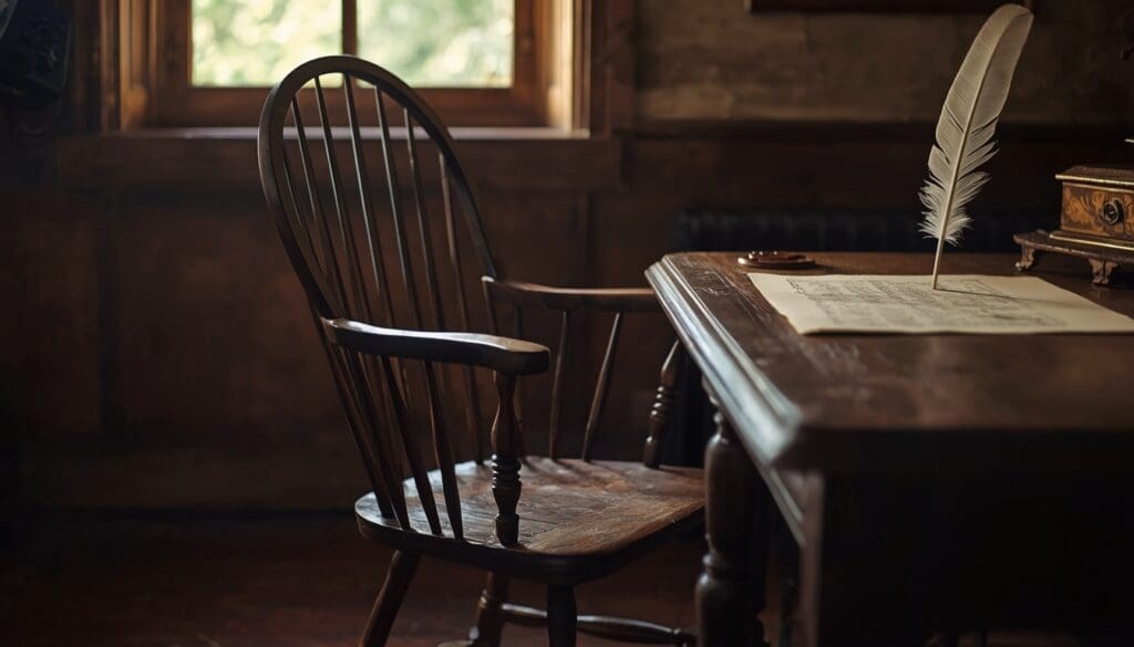
Did You Know? The Declaration of Independence Was Likely Written in a Windsor Chair As America celebrates 250 years of independence, it’s worth looking at one of the quieter witnesses to that history: the humble Windsor chair. Thomas Jefferson is said to have drafted the Declaration of Independence while seated in an unusual revolving Windsor […]
Shopping for a dining table when you have a family of six means you need something that works for Tuesday night homework sessions, weekend pancake breakfasts, and holiday dinners with grandparents—all without taking over your entire dining room. The right table makes family life easier. The wrong one? You’ll feel it every single day. Let’s […]
If you’re working with a compact dining area, you’ve probably already discovered that square and rectangular tables can feel like furniture Tetris. Round dining tables are often the smartest solution for small spaces—they eliminate sharp corners that eat up valuable square footage, create better traffic flow, and somehow make a room feel more spacious even […]