Walking from room to room in your home shouldn’t feel like channel surfing. Yet many of us end up with a navy bedroom, sage green living room, and terracotta kitchen that have absolutely nothing to say to each other. If you’re starting fresh or ready to bring some cohesion to your space, choosing a whole-home color palette is one of the smartest moves you can make. It creates flow, makes decorating decisions easier, and honestly just feels more pulled together.
Start With a Foundation of Three Colors
The easiest approach is the 60-30-10 rule applied home-wide. Pick one dominant neutral (60%), one secondary color (30%), and one accent color (10%). Your dominant color typically lives on walls, large furniture pieces like sofas and beds, and major rugs. Think warm whites, soft grays, beiges, or even a muted blue if you’re feeling adventurous.
Your secondary color shows up in area rugs, curtains, upholstered chairs, and bedding. This is where you can introduce more personality—maybe a sage green, dusty rose, or warm terracotta. Your accent color pops up in throw pillows, artwork, vases, and smaller decor items. This is your fun color that can be bolder and easier to swap out when you get tired of it.
The beauty of this system is that each room can emphasize different ratios while still pulling from the same three colors. Your living room might be heavy on the neutral with pops of both other colors, while your bedroom could flip the script and use more of the secondary color.
Consider Your Home’s Existing Features
Before you fall in love with a palette, take stock of what you can’t easily change. Your flooring is probably staying put, and if you have wood trim, tile backsplashes, or brick fireplaces, those need to play nicely with your chosen colors.
Honey oak floors or warm wood tones pair beautifully with warm neutrals like cream, caramel, and sage. If you have cool gray floors or white trim throughout, you might lean toward cooler grays, blues, and crisp whites. Got a tile backsplash or granite countertops? Pull one of the colors from those materials into your palette—it creates an instant sense of intentionality.
Also think about your home’s natural light. North-facing rooms tend to read cooler and might need warmer colors to feel inviting, while south-facing rooms can handle cooler tones without feeling stark.
Create Variation While Maintaining Cohesion
A whole-home palette doesn’t mean every room looks identical. You want cohesion, not monotony. The trick is varying the intensity and application of your chosen colors from space to space.
Maybe your living room features your neutral on the walls with your secondary color on a large sectional, while your bedroom flips this—secondary color on an accent wall with neutral bedding. Your accent color might appear in living room throw pillows but become a statement armchair in the office.
You can also play with different shades and tones within the same color family. If your secondary color is blue, use a deeper navy in the dining room and a softer sky blue in the bathroom. This creates variety while the underlying color connection keeps everything harmonious.
Transitional spaces like hallways are perfect for leaning heavily into your dominant neutral, which helps different rooms feel connected as you move through the house.
Test Before You Commit
Paint samples are your best friend, but don’t stop there. Grab fabric swatches for any upholstered furniture you’re considering, and if possible, borrow or buy small versions of accent pieces in your proposed colors.
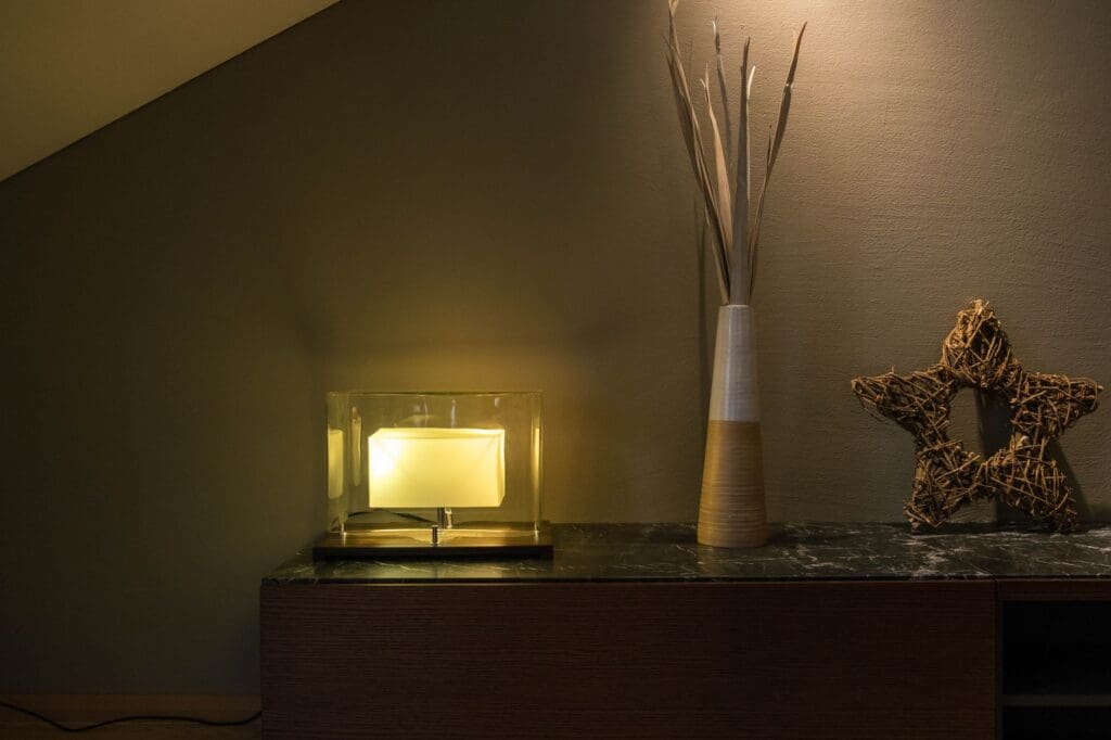
Live with these samples for at least a few days, observing how they look in morning light, afternoon sun, and evening lamplight. Pin fabric swatches to the wall in the actual room where furniture will live. Set potential accent pieces on shelves and tables. Colors can look completely different in your home than they did in the store or on your screen.
If you’re working with a budget, start with paint and smaller items like pillows, throws, and artwork in your new palette. Mid-range investments like curtains and area rugs can come next, with larger furniture purchases saved for when you’re absolutely certain about your direction.
Choosing a cohesive color palette takes some upfront thought, but it pays off every single day. You’ll find decorating becomes easier because you have clear guidelines, and your home will finally feel like a complete, intentional space rather than a collection of random rooms. Start with your three colors, respect what’s already in your home, and give yourself permission to test and adjust until it feels just right.
There’s nothing quite like settling in for movie night at home, but harsh overhead lighting can ruin the whole experience. Too bright, and you’re squinting at a washed-out screen. Too dark, and you’re fumbling for the remote or straining your eyes. Getting your living room lighting right for movie watching isn’t complicated—it just takes the […]
You probably reach for your phone to change the temperature, lock your doors, or check who’s at the front door—so why are you still walking across the room to flip light switches? Smart lighting transforms your living room from a space with basic on-off switches into one that adapts to movie nights, dinner parties, reading […]
A chandelier can transform your living room from ordinary to unforgettable, but choosing the wrong size or style can throw off your entire space. Unlike task lighting that quietly does its job, a chandelier makes a statement—which means getting it right matters. Whether you’re working with vaulted ceilings or a cozy 10×12 room, here’s how […]