If you’re tossing and turning at night or feeling oddly wired when you walk into your bedroom, your color scheme might be working against you. The colors surrounding you have a genuine psychological impact on your stress levels and sleep quality. Let’s look at what actually works when you’re trying to create a bedroom that helps you unwind.
Why Cool and Neutral Tones Win for Sleep
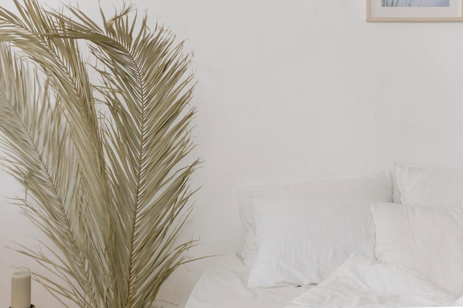
There’s solid science behind why certain colors help you relax. Cool tones like blues, greens, and soft grays naturally lower your heart rate and blood pressure. Blue, in particular, triggers your brain to produce calming chemicals, which is why it consistently ranks as the best color for sleep quality.
When you’re choosing paint, look for colors with names like “misty morning,” “sea salt,” or “pale sage”—these typically have the right muted quality. Avoid anything too bright or saturated on the walls. You want colors that recede rather than jump out at you. Budget-friendly options include basic contractor-grade paints starting around $25-35 per gallon, while premium low-VOC formulas that won’t off-gas as you sleep run $50-75 per gallon.
For bedding and larger furniture pieces like upholstered headboards or bedroom benches, stick with this same cool-toned family. A navy linen duvet or sage green throw pillows will reinforce that calming effect throughout the room.
The Best Multi-Color Combinations That Actually Work
You don’t need to commit to one color for everything—in fact, layering complementary tones creates more visual interest without sacrificing the relaxing vibe. Here are combinations that interior designers return to again and again:
Soft white + warm gray + dusty blue: This trio works beautifully with both modern and traditional bedroom furniture. Use the white for walls, gray for larger pieces like dressers, and blue in textiles.
Greige + sage green + cream: Perfect if your bedroom gets great natural light. The green adds life without energy, while greige (gray-beige) keeps everything grounded.
Pale gray + blush pink + white: This only works when the pink is extremely muted—think barely-there rose, not bubblegum. It adds warmth without the stimulating effect of brighter colors.
Charcoal + soft blue + warm taupe: For those who find lighter colors too stark, this deeper palette still promotes relaxation while feeling more cocooning.
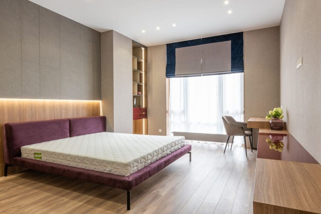
When shopping for bedroom furniture, you’ll find upholstered beds and seating in these neutral tones ranging from $300-800 for budget options, $800-2,000 for mid-range quality, and $2,000+ for heirloom-quality pieces with premium fabrics.
How to Handle Warm Tones Without Sabotaging Sleep
Maybe you love warmer colors and can’t imagine a bedroom without them. You can still create a relaxing space—you just need to be strategic. Warm colors like terracotta, soft peach, or muted gold work when they’re desaturated and paired with plenty of cooling elements.
If you’re set on a warm wall color, balance it with cool-toned bedding, curtains, and rugs. A terracotta accent wall can work beautifully behind the bed when the rest of the room features white linens, a gray upholstered bench, and silvery lamp bases. The key is keeping the ratio at about 30% warm to 70% cool throughout the space.
Avoid red, bright orange, and sunny yellow entirely—these colors are proven to increase alertness and energy, which is exactly what you don’t want when you’re trying to wind down. Save these for your kitchen or home office instead.
Bringing It All Together With the Right Accents
Once you’ve settled on your main color scheme, your nightstands, lamps, artwork, and decorative accessories should support rather than fight it. Wood furniture in lighter finishes (white oak, natural maple, light walnut) tends to feel more calming than very dark or red-toned woods.
For window treatments, consider blackout curtains in a color that matches your scheme—they’ll serve double duty by blocking disruptive light and reinforcing your palette. Layering a sheer white curtain underneath gives you daytime options without sacrificing the calming effect.
When you’re shopping for those finishing touches, remember that matte and soft textures (linen, cotton, brushed wood) feel more relaxing than shiny, reflective surfaces. A bedroom isn’t the place for high-gloss anything.
The bedroom that helps you truly relax isn’t about following rigid design rules—it’s about understanding how color affects your nervous system and making intentional choices. Start with those proven cool and neutral tones as your foundation, then layer in the specific shades that make you feel calm. Your future well-rested self will thank you.
You’ve narrowed your mattress search to latex—smart choice. Latex mattresses are known for their durability, support, and that distinctive responsive feel that’s neither memory foam nor traditional innerspring. But now you’re facing another decision: natural, synthetic, or blended latex? The price difference can be significant, and you want to make sure you’re getting what you’re […]
Shopping for a bunk bed mattress isn’t quite the same as choosing one for a standard bed frame. The biggest difference? Safety requirements. The wrong mattress thickness can create a dangerous gap between the sleeping surface and the guardrails, and not every mattress type holds up well on a slatted bunk bed platform. Here’s what […]
That empty corner in your bedroom has potential. You walk past it every day thinking it could be something more—a spot to read before bed, sip your morning coffee, or just escape for a few quiet minutes. A reading chair can transform that awkward space into your favorite corner of the house, but only if […]