If you’re tossing and turning at night, your bedroom color scheme might be working against you. The colors surrounding you as you drift off have a real impact on your sleep quality—and choosing the wrong ones can leave you staring at the ceiling when you should be dreaming. The good news? Creating a sleep-friendly color palette is easier than you might think, and it doesn’t require a complete room makeover.
Why Color Actually Matters for Sleep
Your brain responds to color on a physiological level. Certain hues trigger the production of melatonin (your sleep hormone), while others stimulate alertness and energy. Studies consistently show that people sleeping in rooms painted with calming colors get more sleep—sometimes up to two additional hours per night compared to those in more stimulating environments.
The key is understanding that you’re not just picking colors you like, but colors that support your body’s natural wind-down process. This applies to everything from wall paint to bedding, curtains, and even the artwork you hang. Think of your bedroom as a color ecosystem where everything works together to signal “it’s time to rest.”
The Best Colors for Better Sleep
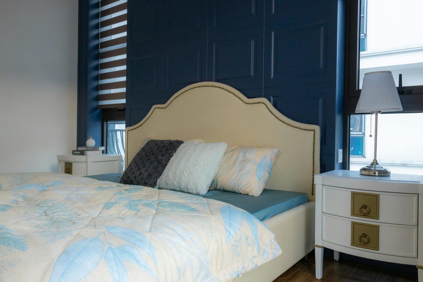
Blue tops the list for sleep-promoting colors, and it’s not just personal preference. Blue shades lower heart rate and blood pressure, creating the ideal conditions for sleep. Soft, muted blues work best—think misty morning sky rather than electric navy. If you’re painting walls, look for colors with names like “borrowed light,” “pale powder,” or “atmospheric.”
Green comes in a close second, especially sage, seafoam, and other nature-inspired tones. Green connects us to the outdoors and promotes feelings of tranquility without feeling cold. It’s particularly effective if you tend toward anxiety at bedtime.
Neutral territory—soft grays, warm taupes, and gentle beiges—provides a calm backdrop that won’t interfere with sleep. These work beautifully if you want flexibility with accent colors in bedding or decor. Warm neutrals (those with beige or yellow undertones) create coziness, while cool neutrals (gray-toned) feel more serene and modern.
Surprisingly, soft, dusty pinks and lavenders also promote relaxation. Just steer clear of hot pinks or bright purples, which swing too stimulating.
Colors to Avoid in the Bedroom
Red is the biggest sleep disruptor. It increases heart rate and can trigger feelings of alertness or even aggression. If you love red, save it for a single throw pillow rather than your duvet cover or walls.
Bright, saturated colors of any kind—electric yellow, vivid orange, deep purple—stimulate brain activity when you need it to quiet down. The same goes for stark white, which can feel sterile and reflect too much light, making it harder to create that cozy, cave-like feeling that encourages sleep.
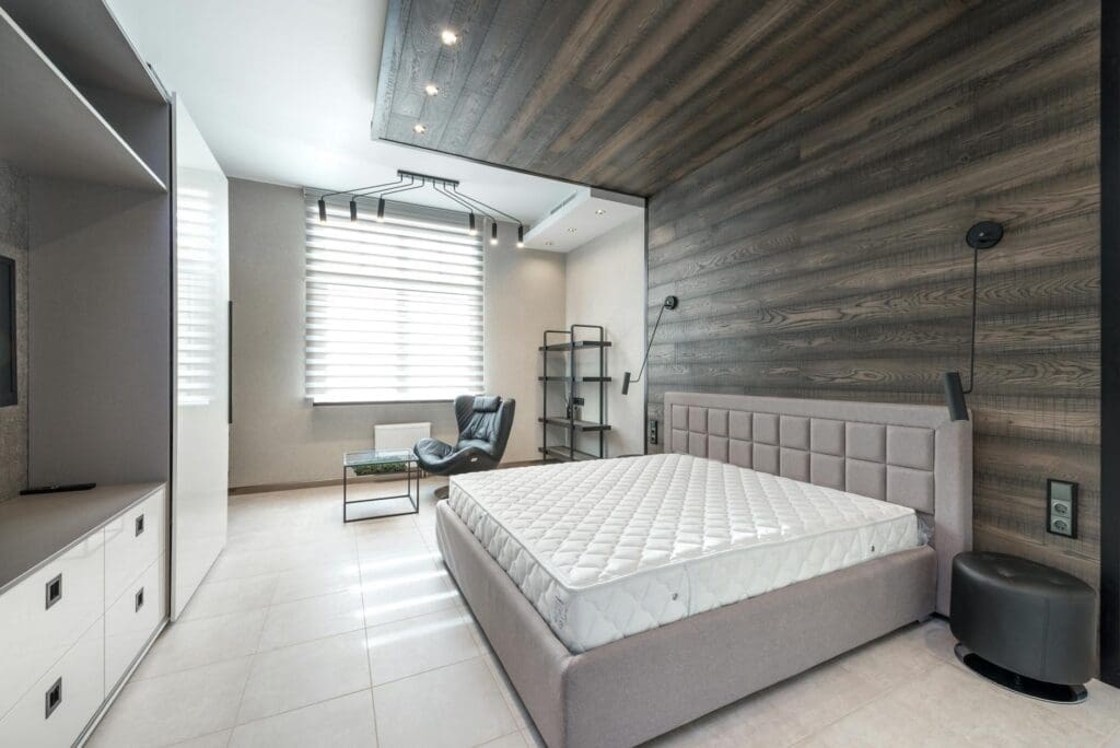
Dark browns and blacks might seem like they’d promote rest, but they can actually feel oppressive and make smaller bedrooms feel cramped. If you’re drawn to dramatic darks, use them as accents rather than dominant colors.
Building Your Sleep-Friendly Color Palette
Start with your walls—they’re the biggest color commitment. If painting feels overwhelming, remember that most paint stores offer sample sizes for $5-10, letting you test colors in your actual lighting before committing. Paint a large poster board rather than directly on walls so you can move it around the room throughout the day.
Your bedding is your next priority since it’s right in your line of sight as you fall asleep. Look for duvet covers and sheets in those calming blues, greens, or neutrals. You’ll find budget-friendly options starting around $30 for sheet sets, mid-range at $80-150, and luxury bedding in natural fibers running $200-500.
Layer in window treatments that support your color scheme while blocking light. Blackout curtains in soft, sleep-friendly shades run $40-100 per panel for good quality options that’ll last.
Finally, consider your furniture and decor as color contributors. A bright accent chair or bold artwork can undermine an otherwise restful palette. This doesn’t mean everything needs to match, but aim for a cohesive feeling where nothing demands attention.
The bedroom colors you choose set the stage for better sleep every single night. By selecting calming blues, soothing greens, or gentle neutrals—and avoiding stimulating reds and bright saturated colors—you’re creating an environment where your body naturally knows it’s time to rest. Start with one change, whether it’s new bedding or a fresh coat of paint, and notice how your sleep improves.
Shopping for a bunk bed mattress isn’t quite the same as choosing one for a standard bed frame. The biggest difference? Safety requirements. The wrong mattress thickness can create a dangerous gap between the sleeping surface and the guardrails, and not every mattress type holds up well on a slatted bunk bed platform. Here’s what […]
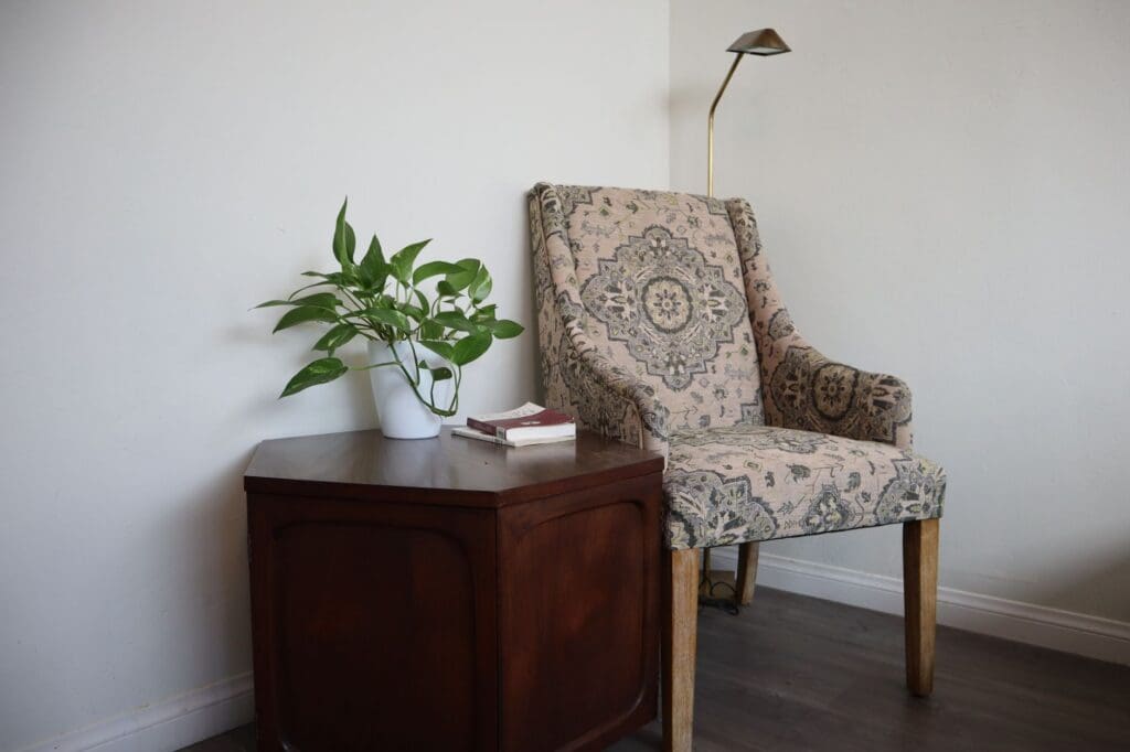
That empty corner in your bedroom has potential. You walk past it every day thinking it could be something more—a spot to read before bed, sip your morning coffee, or just escape for a few quiet minutes. A reading chair can transform that awkward space into your favorite corner of the house, but only if […]
If you’ve been tossing and turning on an old mattress, you already know it’s time for a change. But walk into any mattress store or browse online, and you’re immediately hit with the big question: memory foam or innerspring? Both have passionate fans, and honestly, both can give you great sleep. The real answer depends […]