If your dining room feels stuck in a time warp, you’re not alone. This space often gets overlooked in home updates, but the colors you choose can completely transform how meals feel—whether it’s Tuesday takeout or Thanksgiving dinner. The good news? Today’s trending dining room palettes are surprisingly versatile and easier to pull off than you might think.
Warm Neutrals Are Having a Major Moment
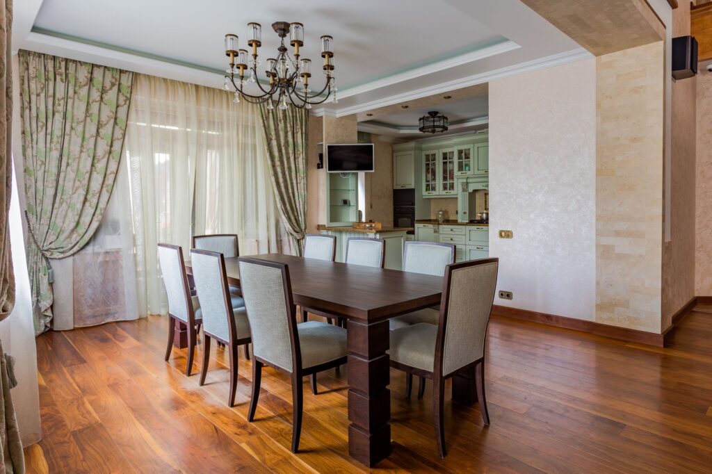
Beige is back, but not the builder-grade beige you’re thinking of. We’re talking about rich, complex neutrals with undertones of caramel, terracotta, and sand. These colors create an incredibly inviting backdrop that works with virtually any furniture style.
Look for shades like warm taupe, greige (that perfect gray-beige hybrid), and creamy off-whites with peachy undertones. These colors make wood dining tables really sing and create a cozy atmosphere without feeling heavy. They’re particularly popular in open-concept homes where the dining area flows into the kitchen or living room—they help define the space without creating a harsh visual break.
If you’re hesitant to commit to paint, consider starting with warm neutral upholstered dining chairs (budget-friendly options start around $150 per chair) or a textured area rug in these tones. You’ll notice an immediate shift in how the room feels.
Deep, Moody Tones for Drama and Intimacy
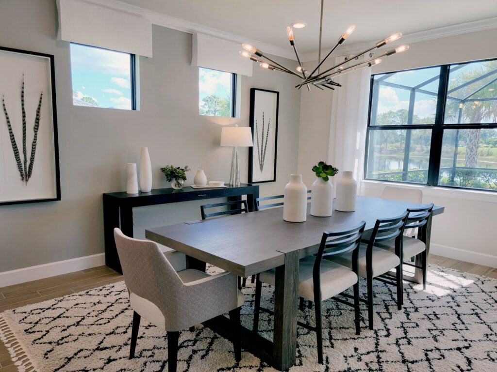
Dark dining rooms are everywhere right now, and for good reason. Deep colors like charcoal, forest green, navy, and even near-black create an intimate, restaurant-like ambiance that makes every meal feel special.
The key to pulling off dark walls is proper lighting. You’ll want a statement chandelier or pendant light (expect to spend $200-$800 for something substantial) plus dimmer switches for flexibility. Dark walls actually make metallic finishes pop beautifully—brass, gold, and even chrome accents look stunning against moody backdrops.
These colors work especially well in formal dining rooms with good natural light during the day. If your dining area is small or lacks windows, consider using deep colors as an accent wall rather than painting the entire space. Pair dark walls with lighter furniture and plenty of reflective surfaces like mirrors or glass to keep things from feeling cave-like.
Earthy Greens That Bring the Outdoors In
Sage, olive, and muted eucalyptus greens are absolutely dominating dining spaces. These colors tap into our collective desire to feel more connected to nature, and they create a remarkably calming environment for gathering.
What makes these greens so practical is their chameleon-like quality—they read as neutral but with more personality. They pair beautifully with natural wood tables, rattan chairs, and linen textiles. You’ll find these shades showing up in:
Painted accent walls behind open shelving or china cabinets
Upholstered dining benches and chairs in velvet or performance fabrics
Table linens and curtains for a softer, less permanent color commitment
Painted furniture pieces like buffets and sideboards
Budget-wise, sage and olive green accessories are everywhere right now, making it easy to test the waters before committing to paint. Start with placemats, napkins, or a table runner in the $30-$60 range to see how you like living with the color.
Unexpected Pops of Terracotta and Rust
These warm, earthy oranges might sound bold, but they’re surprisingly easy to incorporate. You’re seeing terracotta and rust tones used as accent colors rather than primary wall colors—think upholstered dining chair seats, artwork, pottery, and textiles.
What’s great about this trend is how well it layers with the warm neutrals and greens we mentioned earlier. A dining room with creamy walls, a natural wood table, and rust-colored velvet chairs feels both current and timeless. These warm tones also photograph beautifully, which doesn’t hurt if you like sharing dinner party pics.
Look for these shades in area rugs (a 5×8 runner under your table typically runs $150-$400) or in a set of ceramic serving pieces that pull double duty as table decor.
The common thread in all these trending colors? They’re warm, grounded, and create spaces where people actually want to linger. Whether you go all-in with painted walls or start small with textiles and accessories, choosing colors from these popular palettes pretty much guarantees your dining room will feel current and collected rather than dated. Pick the direction that speaks to you, start with one substantial piece or paint commitment, and build from there.
There’s something about farmhouse chandeliers that just works in a dining room—they bring warmth without being fussy, character without feeling overdone. But with so many styles calling themselves “farmhouse,” from sleek metal cages to chunky wood beam fixtures, figuring out which one belongs above your table can feel surprisingly tricky. The right chandelier should anchor […]
A sputnik chandelier makes a serious statement in a dining room—all those radiating arms and exposed bulbs create instant drama and mid-century appeal. But with so many variations in size, arm count, and finish, choosing the right one for your space can feel overwhelming. Get it right, though, and you’ve got a showstopper that pulls […]
When every square foot counts, bringing furniture into a small apartment feels like a high-stakes game of Tetris. You need storage desperately, but you’re terrified of making your space feel even more cramped. A sideboard can be the perfect solution—if you choose the right one. Let’s walk through exactly what to look for so you […]